
BAR SHIRU / VISUAL IDENTITY
Art Direction & Design: Timothy Palmer
Client: Miles Ahead Bar Group, LLC
I was incredibly honored when Dan & Shirin asked me to help them with the visual identity for their Uptown Oakland Japanese Whisky Den, Bar Shiru. Being such good friends with a shared love of Japan, Whisky, & Music made this a total delight and probably the most rewarding project of my career.
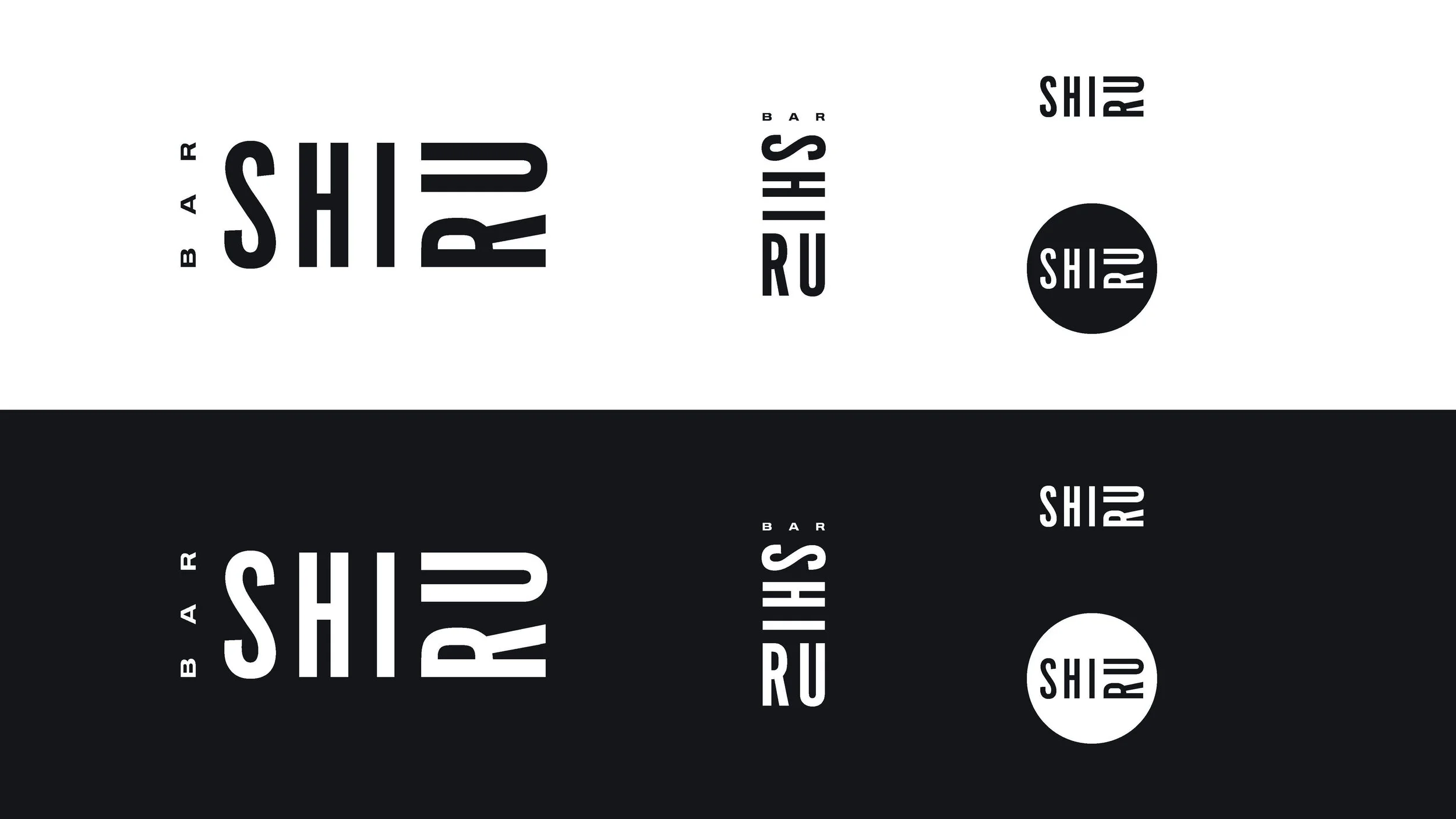
Wordmark
With the mark our aim was to deliver something concise, bold, and flexible that would couple both utility & style while celebrating the improvisational nature of Jazz as well as hinting at Japanese Artistic Heritage. Through custom typography modeled from The Blue Note Era and utilizing a mixed orientation layout- the mark serves to aid in pronunciation, Shi-Ru, while also remaining flexible in a vast array of scales, orientations, and usages.

Color Palette
Affectionally referred to as Walima Nights- our palette is inspired by the bar’s owner & namesake, Shirin, and is a celebration of her heritage. The colors are drawn from and based upon traditional Pakistani celebratory attire and were chosen to serve as a direct compliment to the warm wooden interior of the bar.
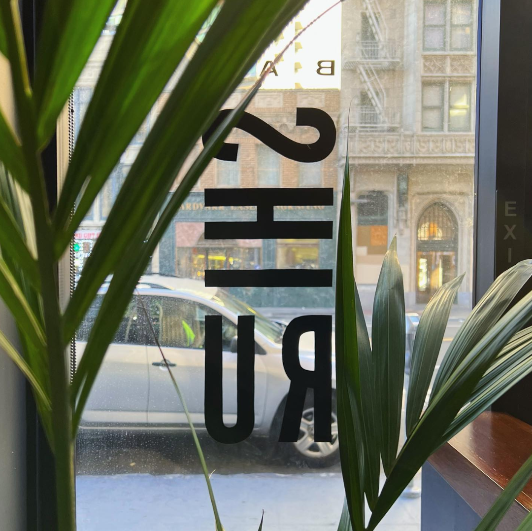
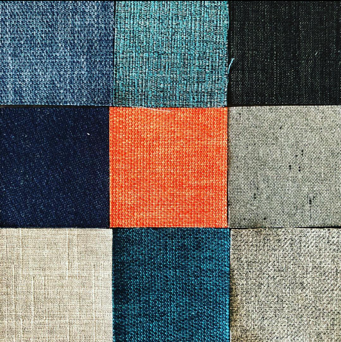
Photo credit: Daniel Gahr

Typography
A varied selection of type was chosen as a furtherance of the design concept helmed by the workmark. Trade Gothic, as a staple within the jazz community and true to it’s workhorse roots, serves to anchor the brand through it’s character, airy nature, and sheer utility. Addington Italic Light and Trade Gothic LT Extended were chosen to further anchor the brand in both the past & present. Working together- they can be combined in a near endless manner to convey a number of messages & tones.


Form
Traditional Japanese patternwork informed & inspired our design language which is used to further inform and contribute to the overall concept. They can be rotated, scaled, and tiled to create endless iterations with the intent to mirror the same meticulous craft & care that goes into both music production and cocktail creation.


Photo credit: Daniel Gahr
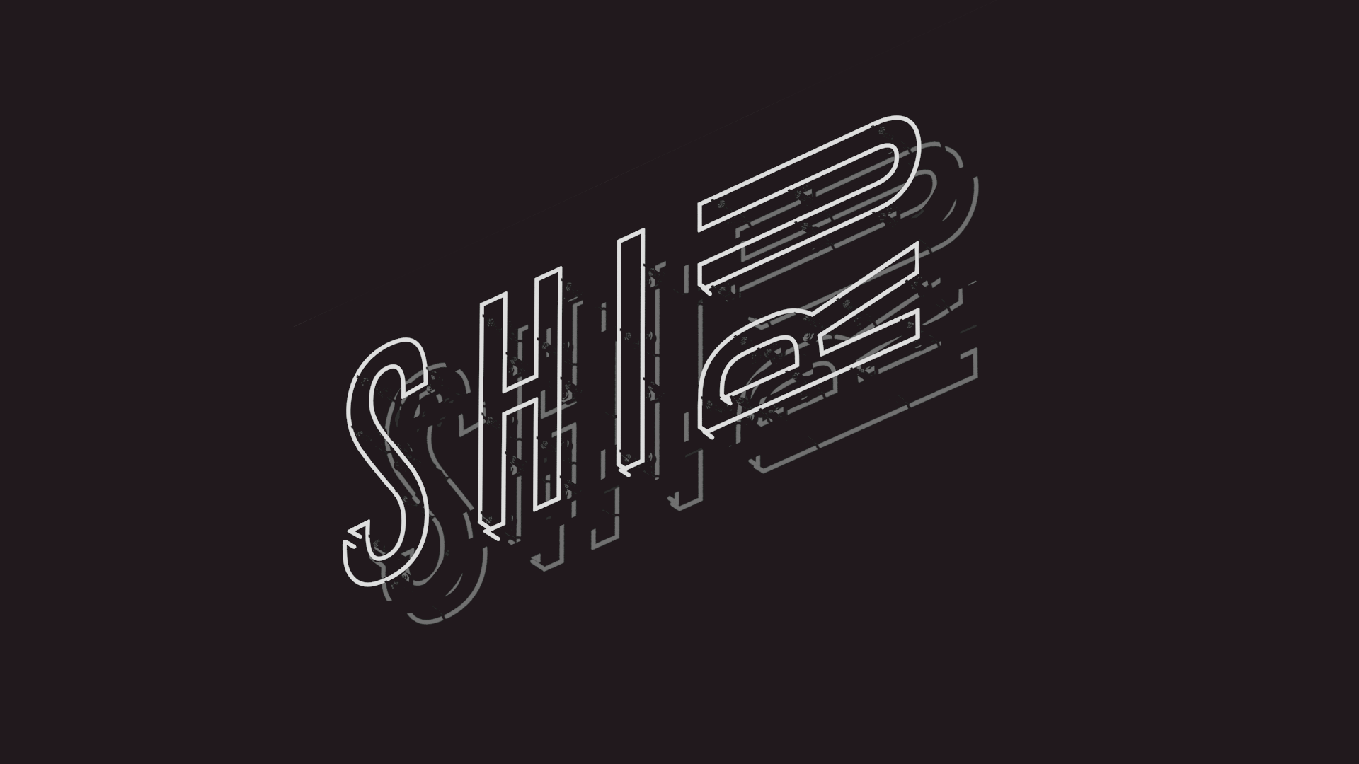
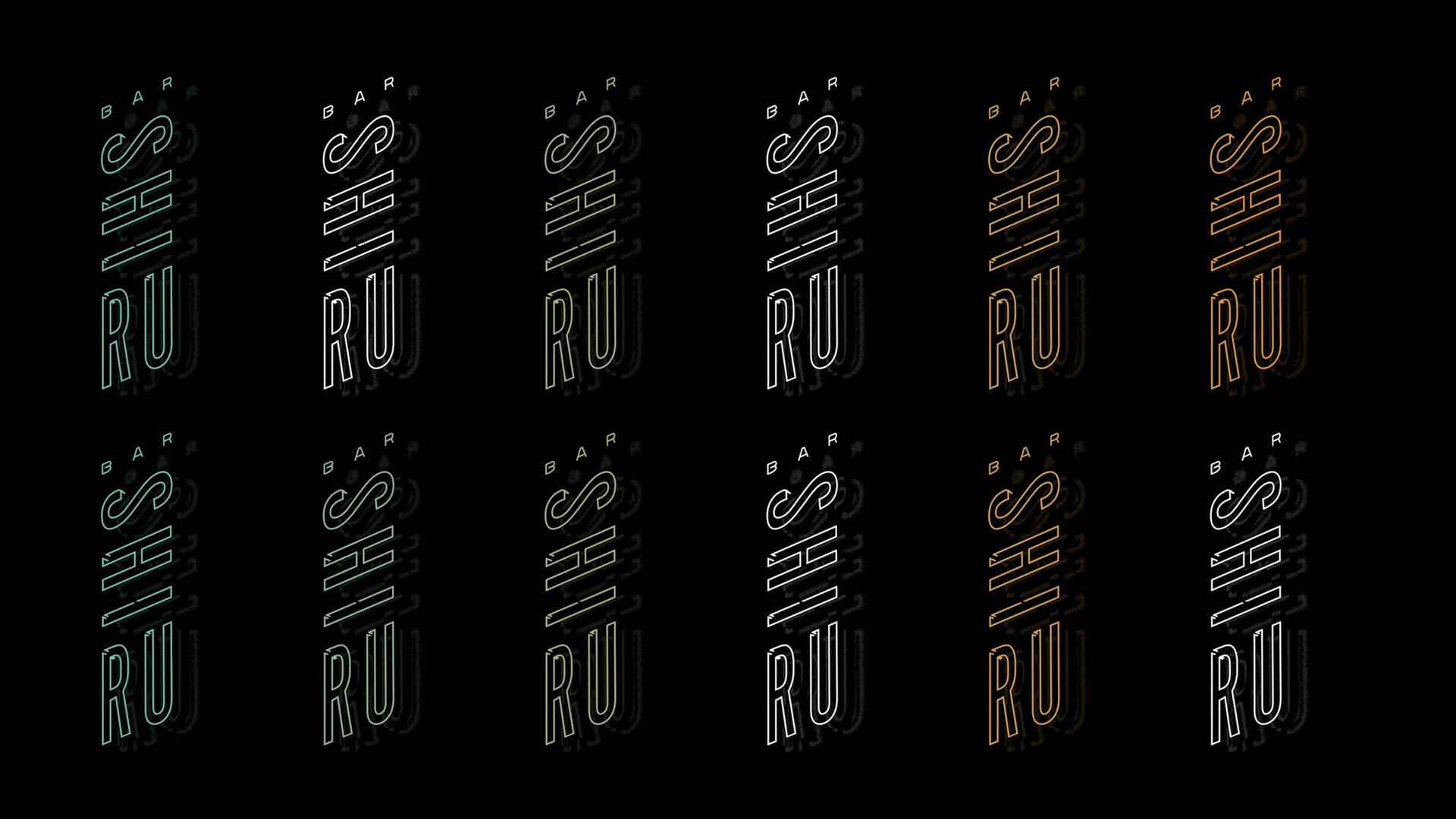
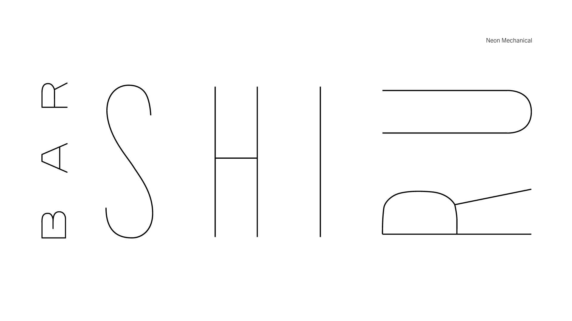
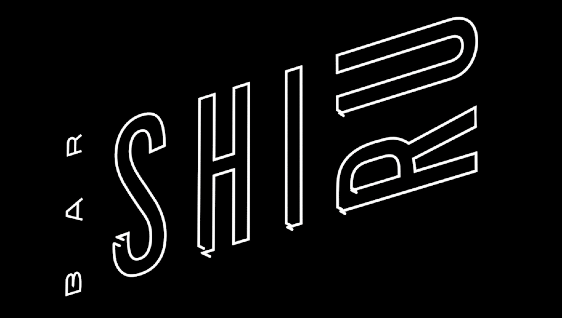
NEON
One thing that we all wanted for the bar was a giant neon sign. We found our sign-maker, got mechanicals ready, and did a bunch of pre-vis but unfortunately were unable to move forward due to some structural concerns on the buildings façade. Shown here are selected pre-vis elements.

A selection of wordmarks from our design exploration